
Problem Statement
Chobani’s current plant based sub brands, “Chobani Oat” and “Chobani Coconut”, do not stand out in the rapidly growing, highly competitive, dairy free market.
Goal
To re imagine Chobani’s current plant-based yogurt products and create a unique sub brand to appeal to their target audience more effectively.
Individuals who are lactose intolerant
People who have concerns for animal welfare
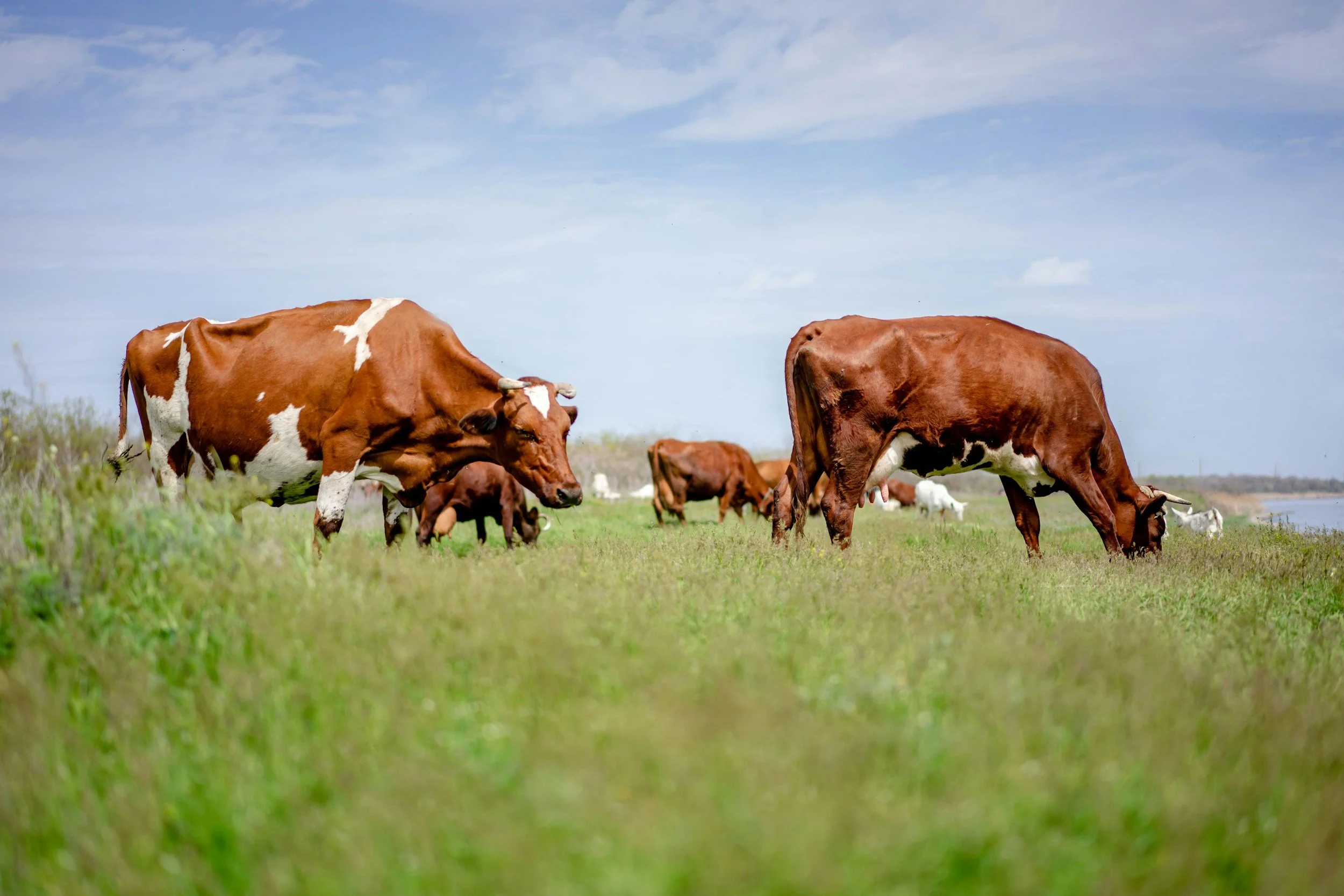
People who want to lower their impact on the environment
Who are our audience?
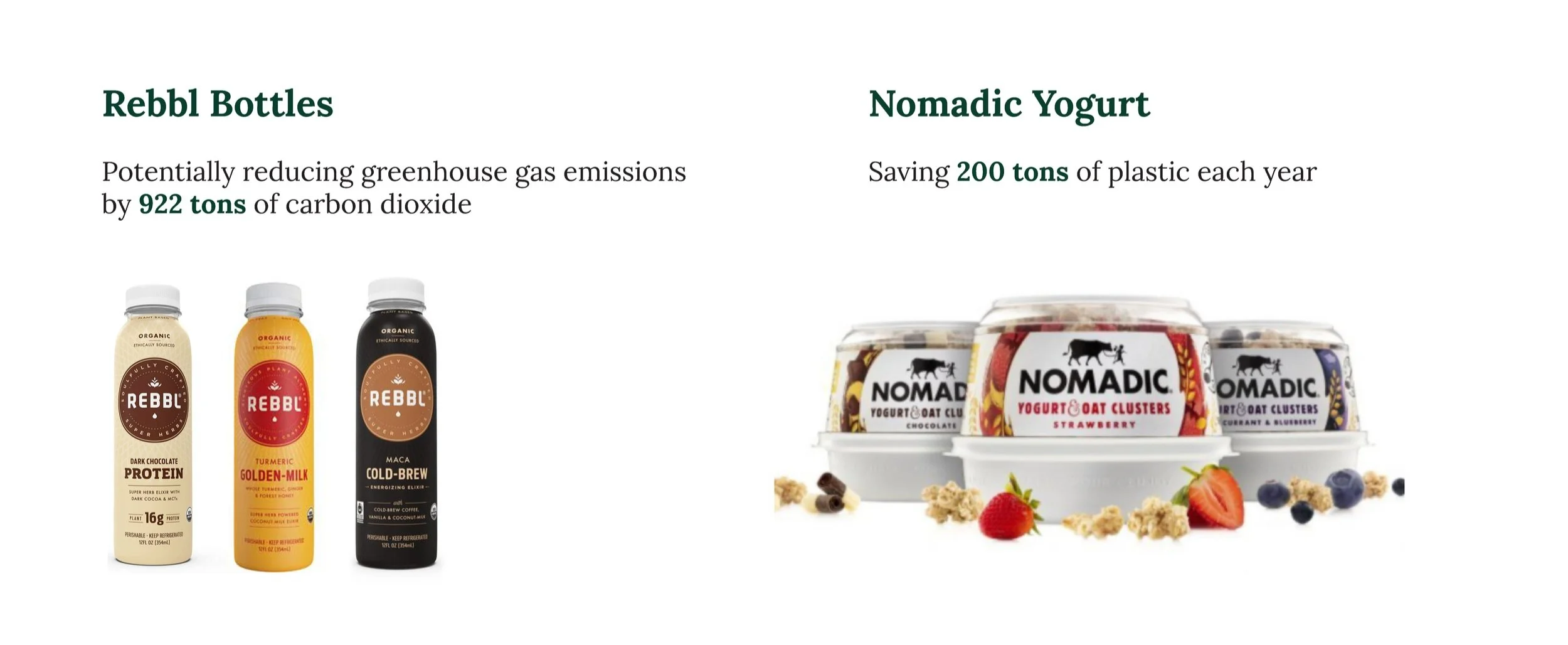
My team wanted to significantly lower our environmental impact by following in the footsteps of other innovative companies, such as Rebbl and Nomadic Yogurt, and by closely examining the strategies they have implemented to effectively reduce their overall carbon footprint.
Save Earth

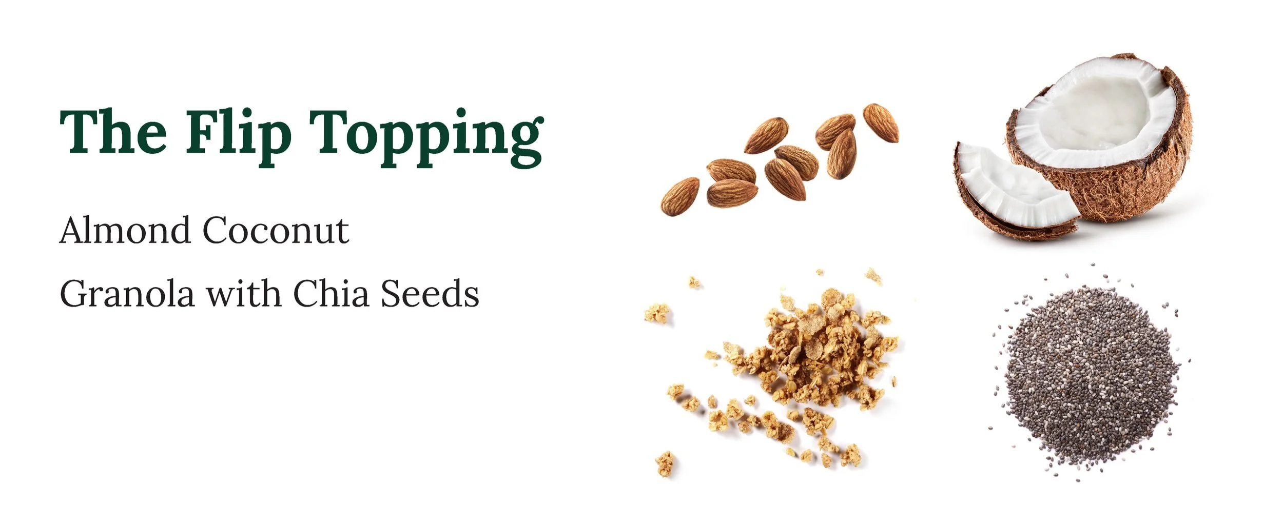
We ultimately decided on a delightful and harmonious combination of wholesome oats and refreshing strawberry flavor, thoughtfully complemented with a thoughtfully curated selection of crunchy almonds, rich coconuts, nutritious granola, and nutritious chia seeds as enticing toppings. This careful and deliberate choice was made to create a truly flavorful option that appeals to a broader audience while also satisfying various taste preferences and dietary needs.

We aimed to redesign Chobani’s identity specifically for an audience that is searching for diverse options for oats but often struggles to find them in their local markets.

Some of the issues associated with the flip design stem from the cup, which has been constructed to barely accommodate any toppings, limiting versatility. Furthermore, the flipping action itself is not functioning as efficiently as it ideally should, resulting in potential challenges for users who seek a seamless experience.
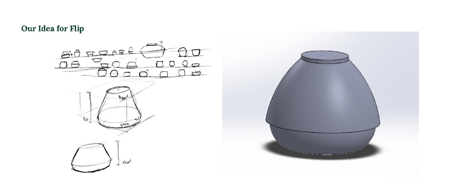
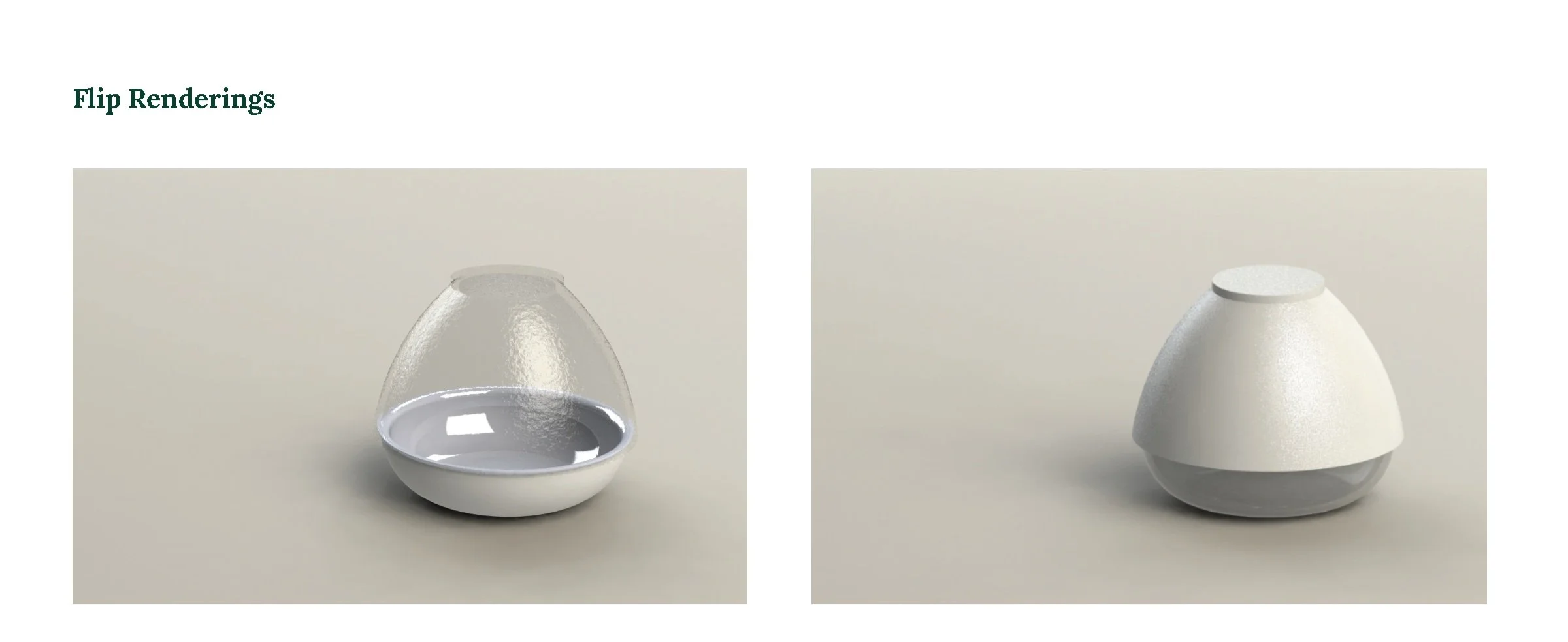
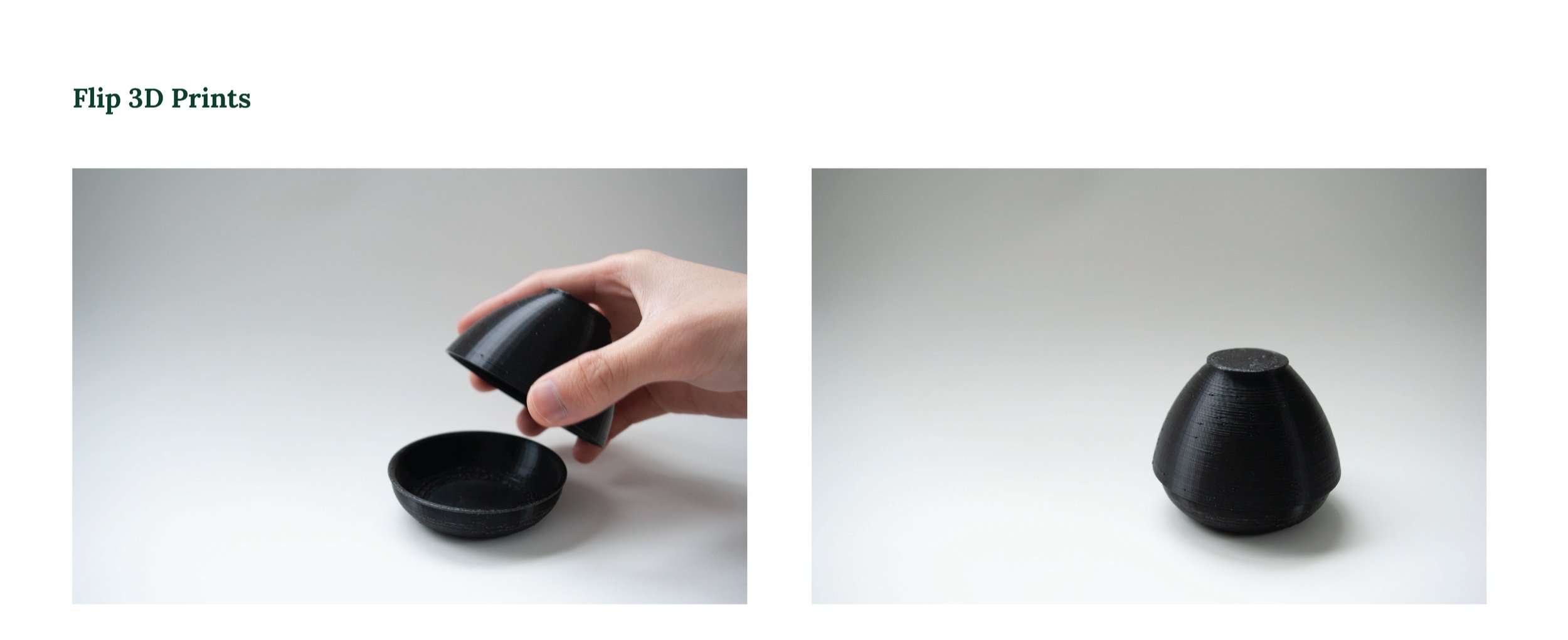
In our design process, we concentrated intently on the silhouette and profile of the innovative flip design, aiming for a more organic, inviting, and iconic aesthetic. After numerous iterations and thoughtful considerations, we successfully landed on this particular form and fell in love with the unique shape and overall aesthetic of this model, envisioning how beautifully it would complement various display shelves.

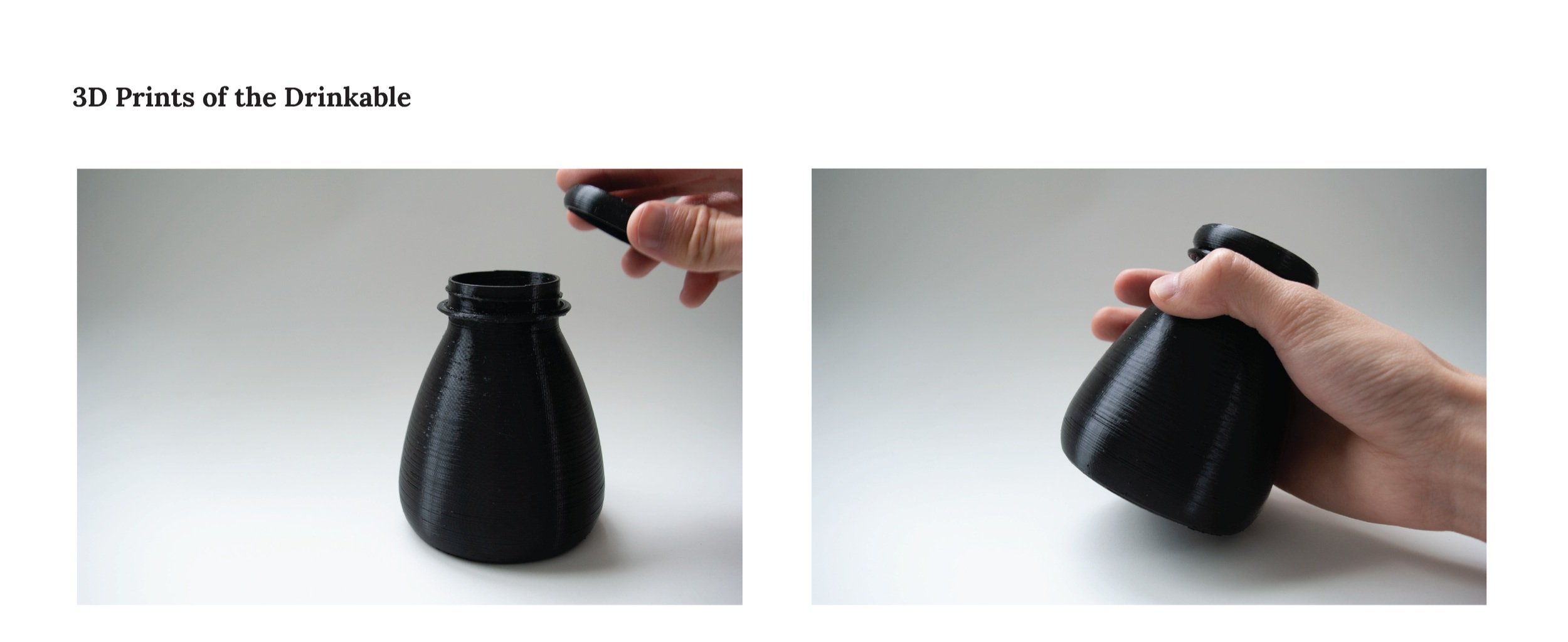
In our drinkable design, we aimed to ensure that it seamlessly matches the organic shape reminiscent of the flip design, allowing the bottle to rest comfortably and naturally in your hand while providing an enjoyable user experience.

For our standard yogurt design, we have thoughtfully chosen to maintain the existing design from the flip version, omitting the topping half. This decision was made to optimize production efficiency and streamline our processes. Additionally, it allows us to preserve the brand identity and ensure design consistency across all product iterations, thereby reinforcing our commitment to quality and coherence in our offerings.


